
Rare Beauty
Rare Beauty
Reimagining the beauty retail experience for visually impaired customers.
Reimagining the beauty retail experience for visually impaired customers.
Topic
Topic
Human Computer Interaction
Human Computer
Interaction
Timeline
Timeline
10 weeks
10 weeks
Role
Role
UX Researcher
UX Strategy & Feature Ideation
UI Design & Prototyping
UX Researcher
UX Strategy & Feature Ideation
UI Design & Prototyping
The Beauty Industry
The Beauty Industry
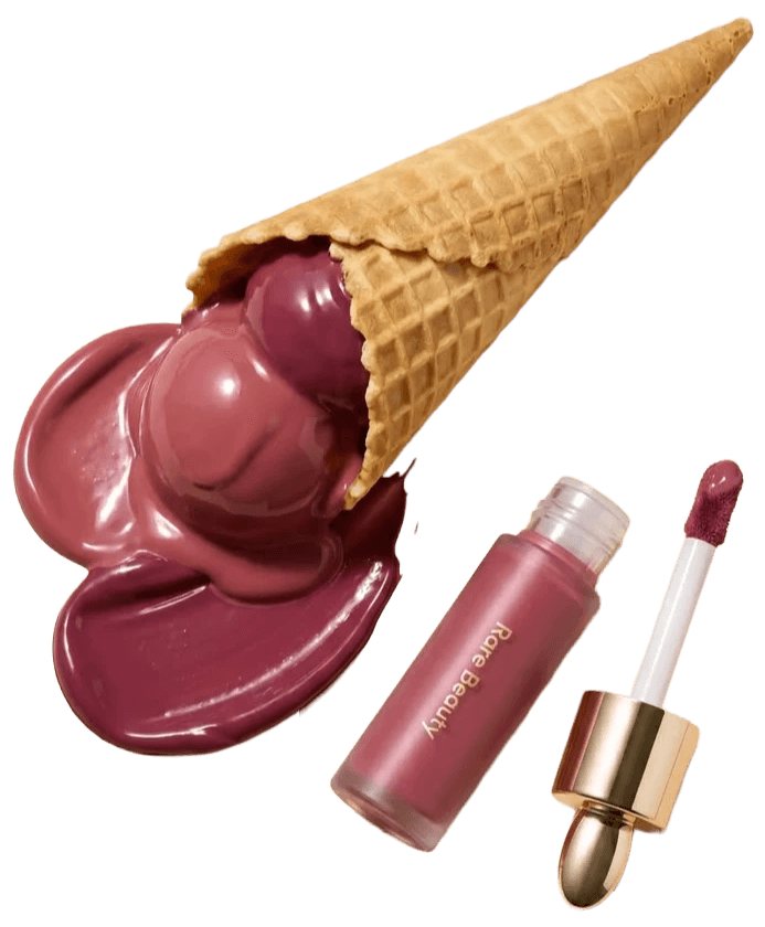
Every beauty store is built the same way. None of that is a flaw exactly, it's just what "beauty retail" has always meant. Visual, first and only.
Every beauty store is built the same way. None of that is a flaw exactly, it's just what "beauty retail" has always meant. Visual, first and only.
Which is fine, until someone walks in who can't rely on any of it. The obvious read is that the products are the problem. They're not, not really. The real gap shows up a few seconds earlier than that, in the moment a visually impaired customer turns to an employee and asks for help, and the employee freezes. Not from a lack of care. From a lack of anything to say. Nobody ever taught them how to describe a lipstick out loud.
Which is fine, until someone walks in who can't rely on any of it. The obvious read is that the products are the problem. They're not, not really. The real gap shows up a few seconds earlier than that, in the moment a visually impaired customer turns to an employee and asks for help, and the employee freezes. Not from a lack of care. From a lack of anything to say. Nobody ever taught them how to describe a lipstick out loud.
Testers lined up by shade.
Testers lined up by shade.

Swatches you're meant to look at.
Swatches you're meant to look at.

Packaging fighting for your eye before it ever earns your hand.
Packaging fighting for your eye before it ever earns your hand.

Where the problem lies
Where the problem lies
Two failures, stacked on top of each other.
Two failures, stacked on top of each other.
The product fails first. Every eyeshadow pan feels the same under a finger, every brush is distinguished only by a label, and a label is exactly what a blind customer can't use.
Then the person fails too, not by choice. Store employees want to help, but they've only ever had packaging copy written to be read, not spoken. Most are describing a shade out loud for the first time in the exact moment a customer needs them to.
The product fails first. Every eyeshadow pan feels the same under a finger, every brush is distinguished only by a label, and a label is exactly what a blind customer can't use.
Then the person fails too, not by choice. Store employees want to help, but they've only ever had packaging copy written to be read, not spoken. Most are describing a shade out loud for the first time in the exact moment a customer needs them to.

Ideation and Iterations
Ideation and Iterations
The usual inclusive-design instinct is to fix the product — braille, packaging — and stop there. But that only solves half the problem; the other half lives in the conversation between employee and customer, in whether the right words exist in that moment.
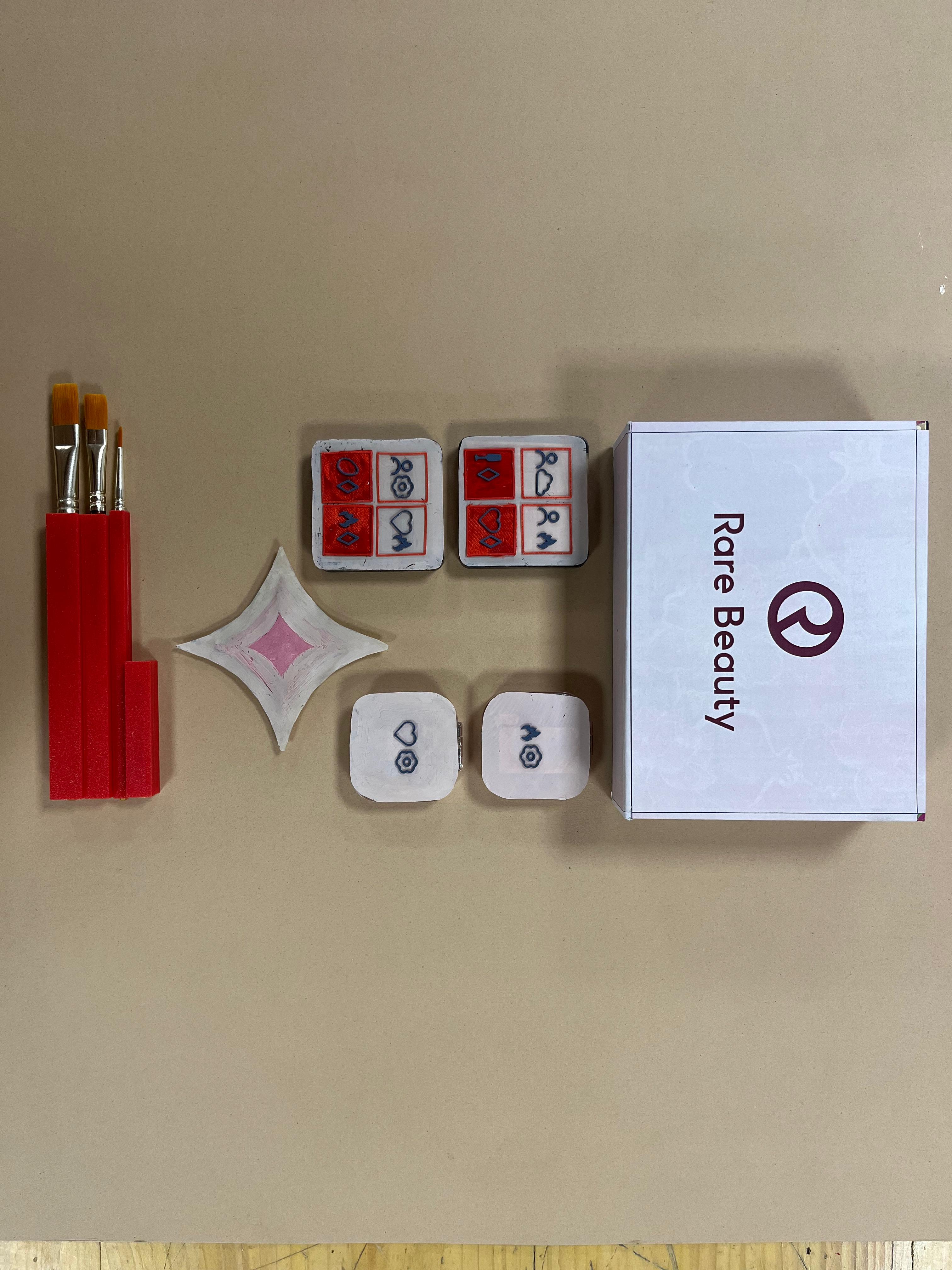
So the solution has two parts working together: an interface that helps employees describe beauty products naturally and knowledgeably to visually impaired customers, and a makeup kit redesigned around touch, so customers can start forming their own impression before a word is even spoken.
The usual inclusive-design instinct is to fix the product — braille, packaging — and stop there. But that only solves half the problem; the other half lives in the conversation between employee and customer, in whether the right words exist in that moment.
So the solution has two parts working together: an interface that helps employees describe beauty products naturally and knowledgeably to visually impaired customers, and a makeup kit redesigned around touch, so customers can start forming their own impression before a word is even spoken.

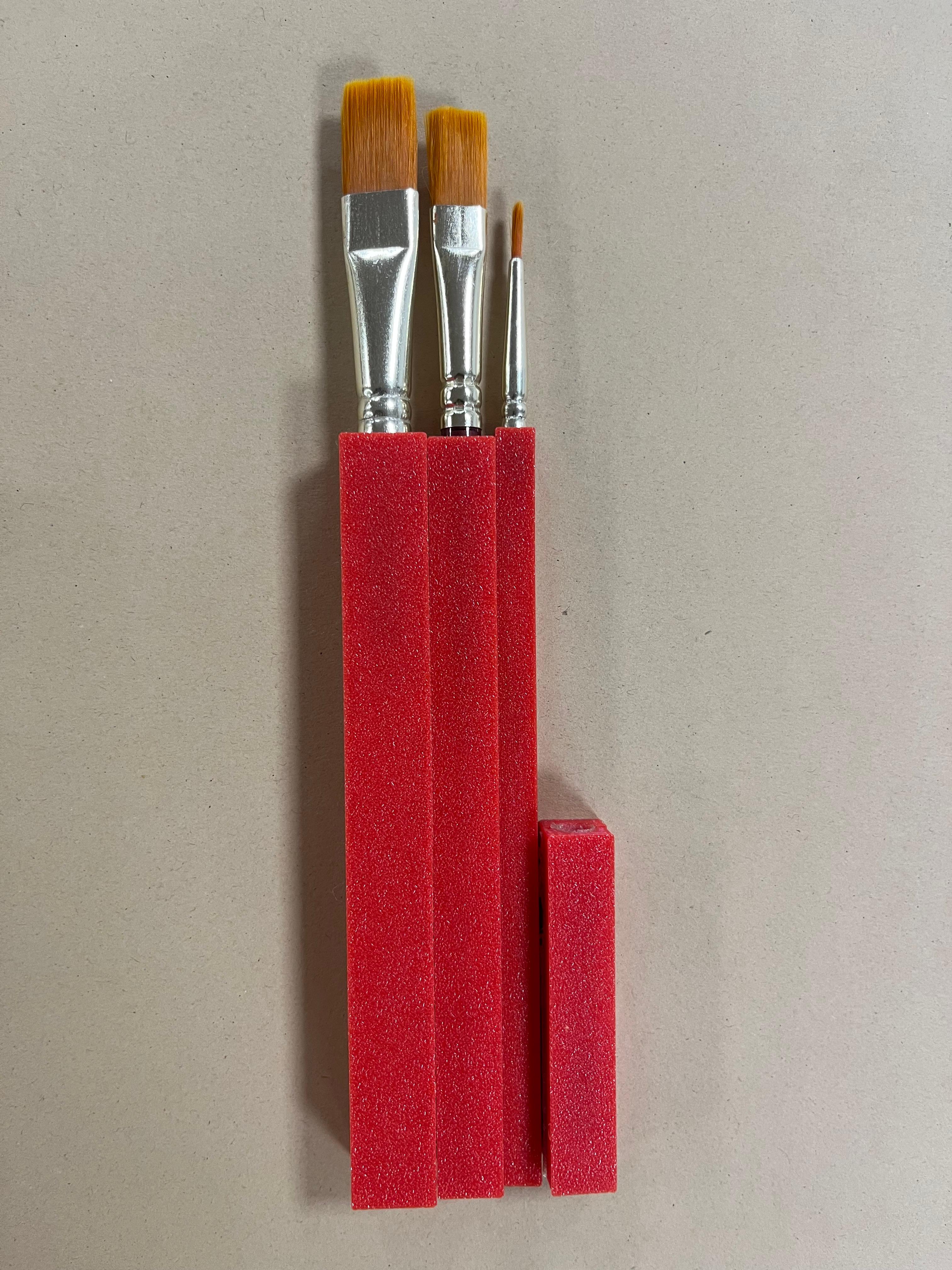


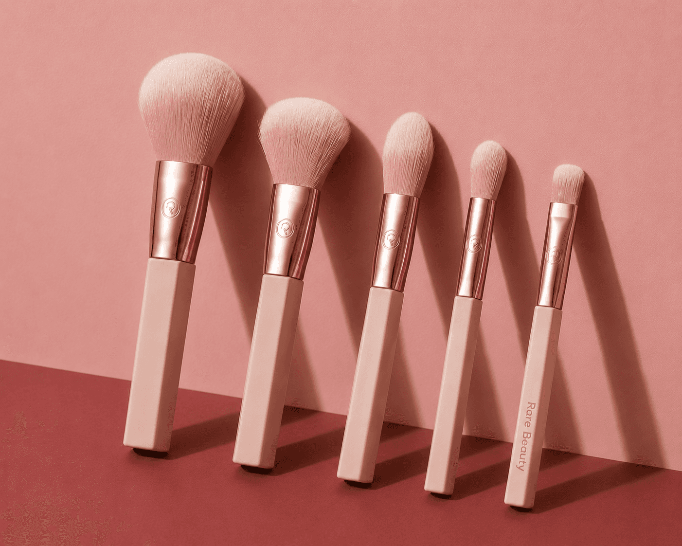
Redesigning the brush shapes: standard makeup brushes have round handles, which means they often roll off the table. The redesigned brushes add flat edges to the handle, stopping them from rolling away.
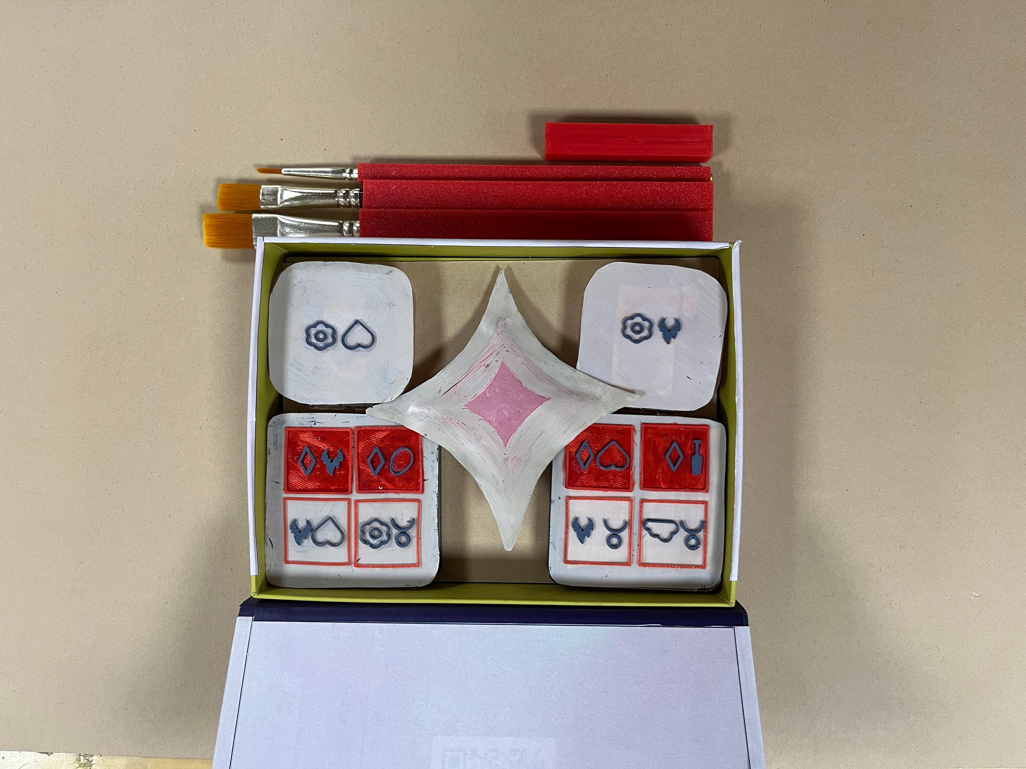
A tactile icon system was developed to help users identify shades through touch. Simple embossed symbols and their combinations create a consistent, easy-to-learn language that supports independent product navigation.


A tactile icon system was developed to help users identify shades through touch. Simple embossed symbols and their combinations create a consistent, easy-to-learn language that supports independent product navigation.
A tactile icon system was developed to help users identify shades through touch. Simple embossed symbols and their combinations create a consistent, easy-to-learn language that supports independent product navigation.

Redesigning the brush shapes: standard makeup brushes have round handles, which means they often roll off the table. The redesigned brushes add flat edges to the handle, stopping them from rolling away.
Redesigning the brush shapes: standard makeup brushes have round handles, which means they often roll off the table. The redesigned brushes add flat edges to the handle, stopping them from rolling away.

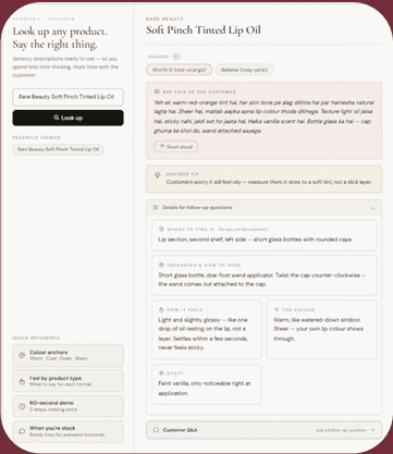
After multiple iterations, the interface was reduced to its essentials. The original guided consultation proved too slow for a busy retail environment, so it evolved into two focused screens: Find It and Read It. This simplified flow enables faster interactions while supporting more confident, informed, and inclusive conversations at the beauty counter.
After multiple iterations, the interface was reduced to its essentials. The original guided consultation proved too slow for a busy retail environment, so it evolved into two focused screens: Find It and Read It. This simplified flow enables faster interactions while supporting more confident, informed, and inclusive conversations at the beauty counter.

Final Outcomes
Final Outcomes


Learnings
Learnings
This project reshaped my understanding of inclusive design. I realized it's not about adding accessibility features, but questioning every design decision from perspectives beyond my own. The biggest lesson was that simplicity is essential, not aesthetic. Every unnecessary element creates friction, and in accessibility, friction means failure. More than design principles, this project changed the way I think about designing.
This project reshaped my understanding of inclusive design. I realized it's not about adding accessibility features, but questioning every design decision from perspectives beyond my own. The biggest lesson was that simplicity is essential, not aesthetic. Every unnecessary element creates friction, and in accessibility, friction means failure. More than design principles, this project changed the way I think about designing.